Brand Design Project
WATT Torque & Porta Power
Refreshing a trusted but outdated brand and developing a strong digital presence.
The Challenge?
WATT knew it was time to refresh their digital presence—keeping their strong customer connection intact while stepping confidently into the future. The focus? Modernising the brand and elevating their hires division to unlock new growth potential.
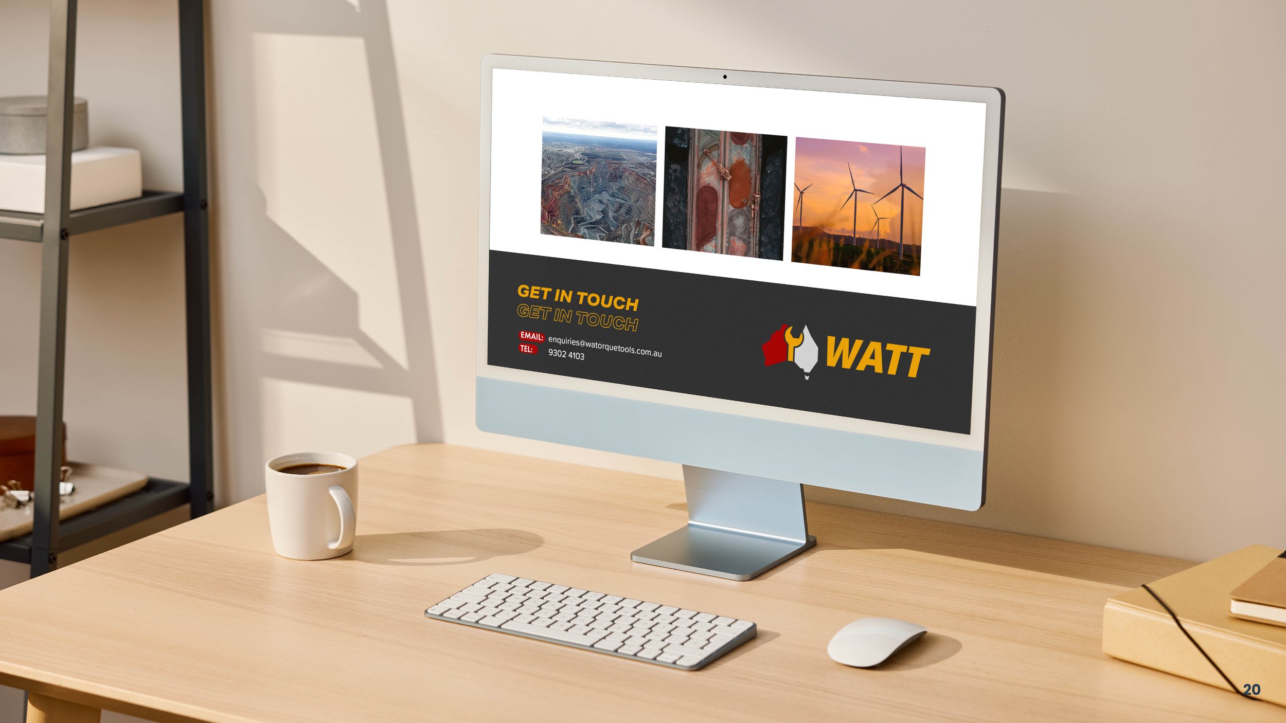
We built a bold, cohesive brand identity that captured WATT’s values, vision, and unique edge in the market—ensuring consistency across every touchpoint, from digital platforms to printed collateral.
Our strategy covered the full digital landscape: social media marketing, targeted email campaigns, online advertising, and refreshed website content—all designed to speak directly to WATT’s audience.
The result? A modernised brand that not only reflects who WATT is today, but positions them for where they’re headed—strengthening their industry presence and unlocking new opportunities.
Before & After
We gave WATT’s logo a refresh—preserving the elements their audience trusted most, while updating the look for a new era. It’s still unmistakably WATT. Just sharper, cleaner, and made to connect with today’s customer.

Before

After
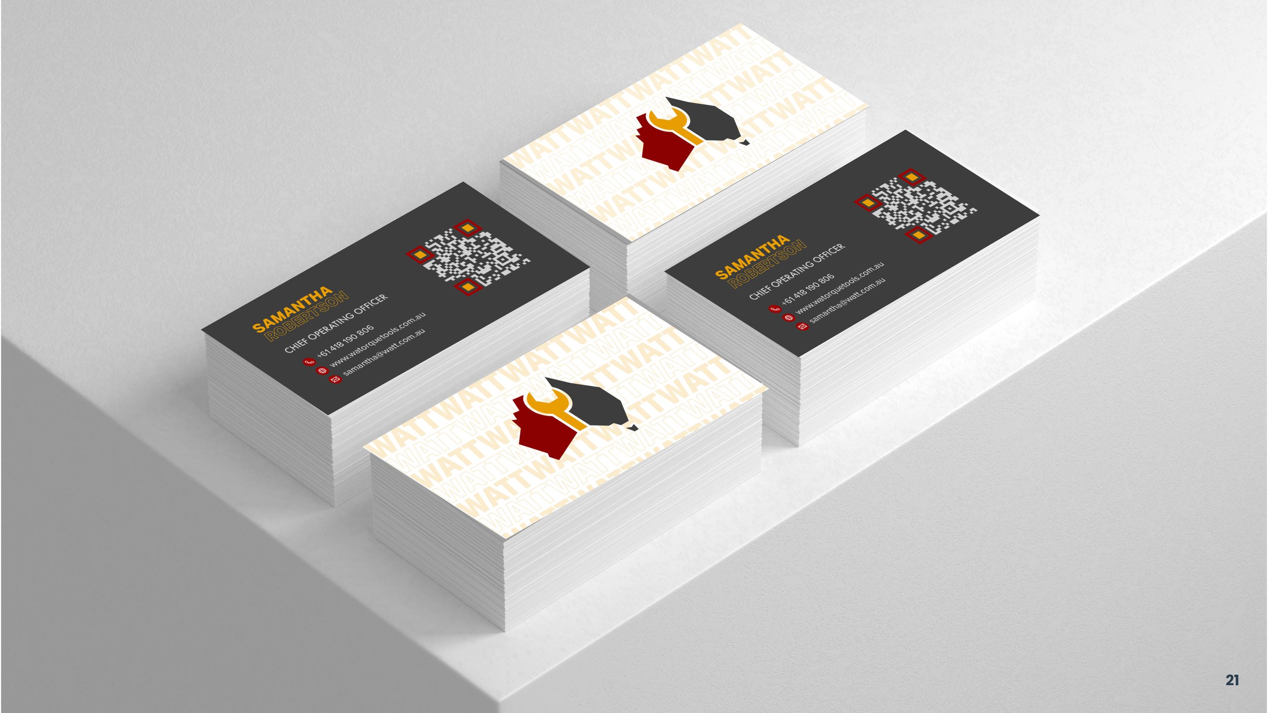
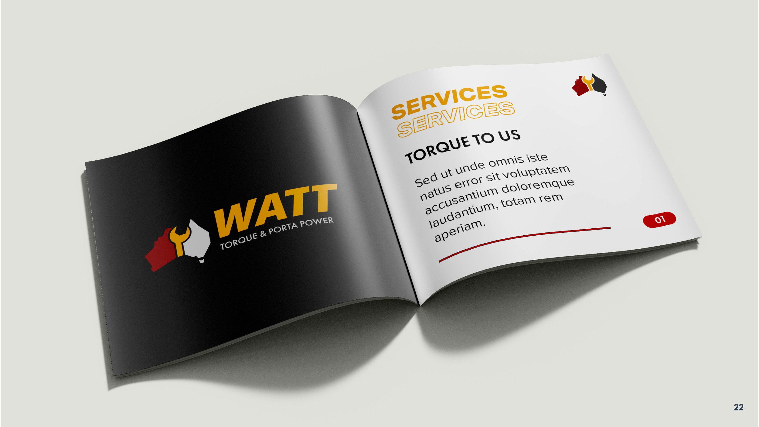
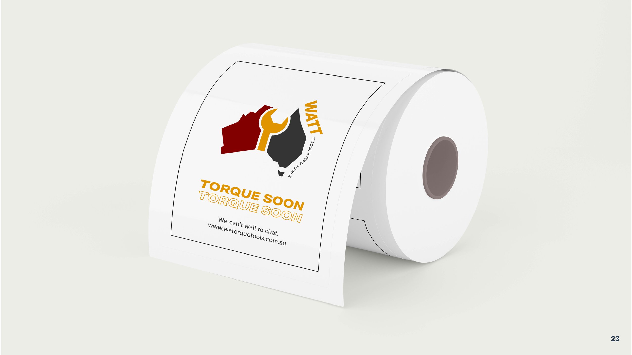
One Logo Is Never Enough
In every branding project, flexibility is key. Your visual identity should adapt effortlessly—whether it’s on a billboard, social post, or email signature. That’s why we build brands that work everywhere, not just somewhere.

Visual Identity