Brand Design Project
Vasse Group

Creating a modern, corporate brand that solves problems.
Vasse Group
Vasse Group is a consultancy firm with expertise in HSEQ, management systems, and project management. Their services extend to a variety of corporate industries. They excel at filling the gaps in company management systems and offer specialised skill sets.
Their clean and professional image reflects their professionalism and commitment to excellence, while also focussing on the problem-solving nature of the business.
Values: Technical | Current | Professional | Dynamic | Savvy
Brand Direction
This custom mood board was chosen in the Creative Direction stage of the design process.
The direction chosen is very crisp and uncomplicated, relying on a very simple but effective approach to communicate the brands purpose and strength. Dynamic and savvy problem-solving are on show through the connectivity of the double S, while still remaining dependable and current. The colour palette features natural and warm colours, which reaffirms the human and trust-worthy side of the brand. The use of orange to support the teal reinforces Vasse Group’s most significant target audience (safety), while still creating a stand-out and unique brand within the industry.
Main Logo
The logo epitomises the brand values, providing a clean and sleek option that feels both professional and savvy. It encapsulates the core capability of connection, be it talent or business solutions, Vasse connects businesses with where they need to be.
Secondary Logo
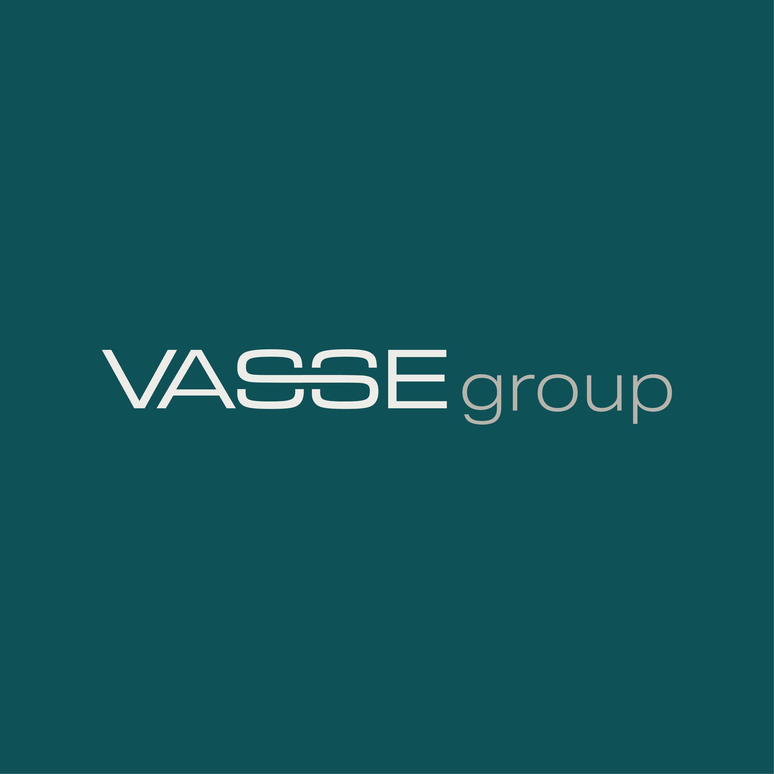
This style provides an elongated version logo, which is often the most suitable option in long, skinny spaces such as headers and footers of documents and websites. This style is also helpful in certain instances with design collateral (brochures, flyers, etc).
Note: The height of "group" comes up exactly half way to provide a pleasant and balanced distinction between the two. This allows Vasse to shine while also providing an added elegant and sleek statement.
Logo Mark
Logo Marks are a simplified version of your main logo. This consists of either 2 letters or an icon/symbol. These parts of the main logo are the most striking and evident, therefore, they form the logo mark.
The symbol stands for balance, reliability, collaboration, trust, and connectedness. It perfectly emulates an S when within the logo, but simply represents a dynamic icon when presented alone.
Submark Logo
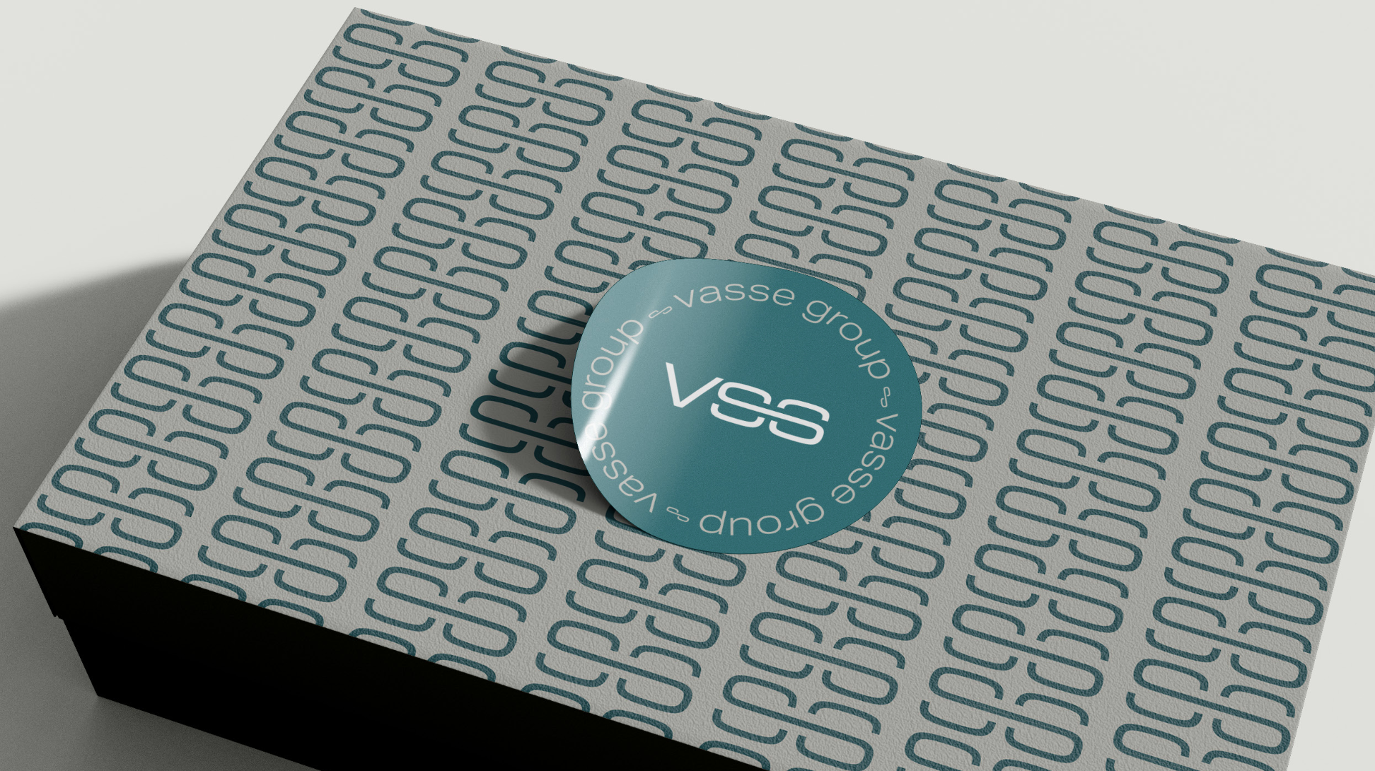
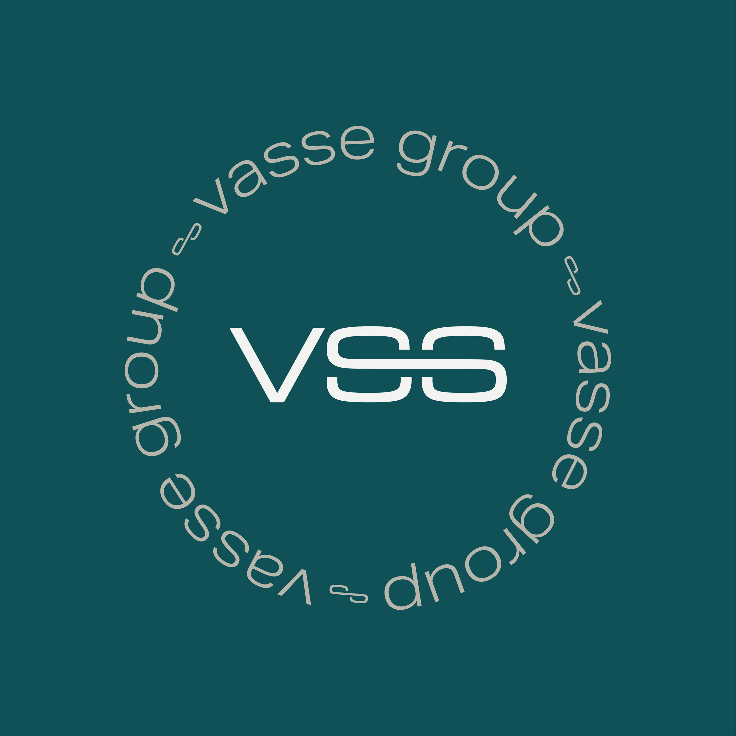
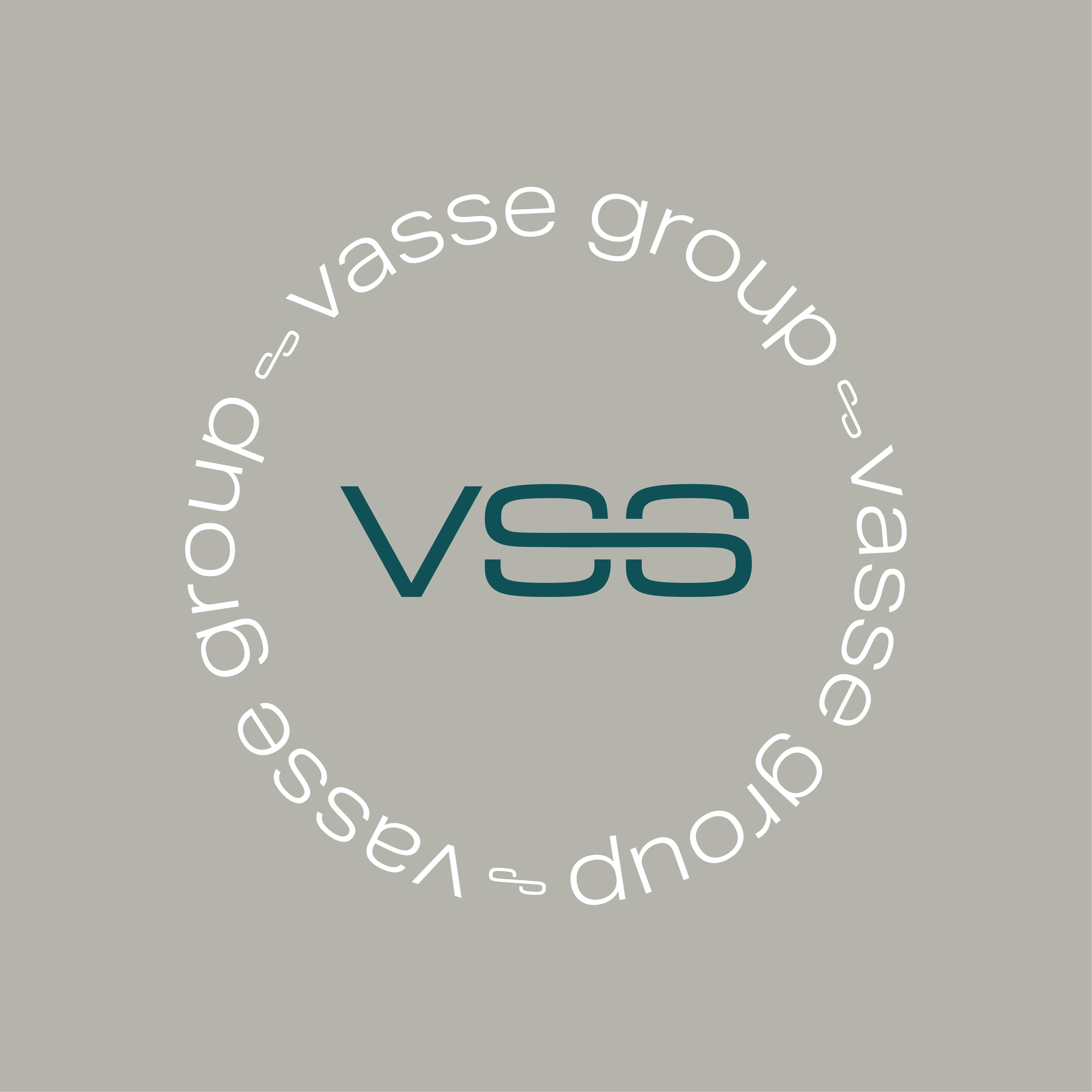
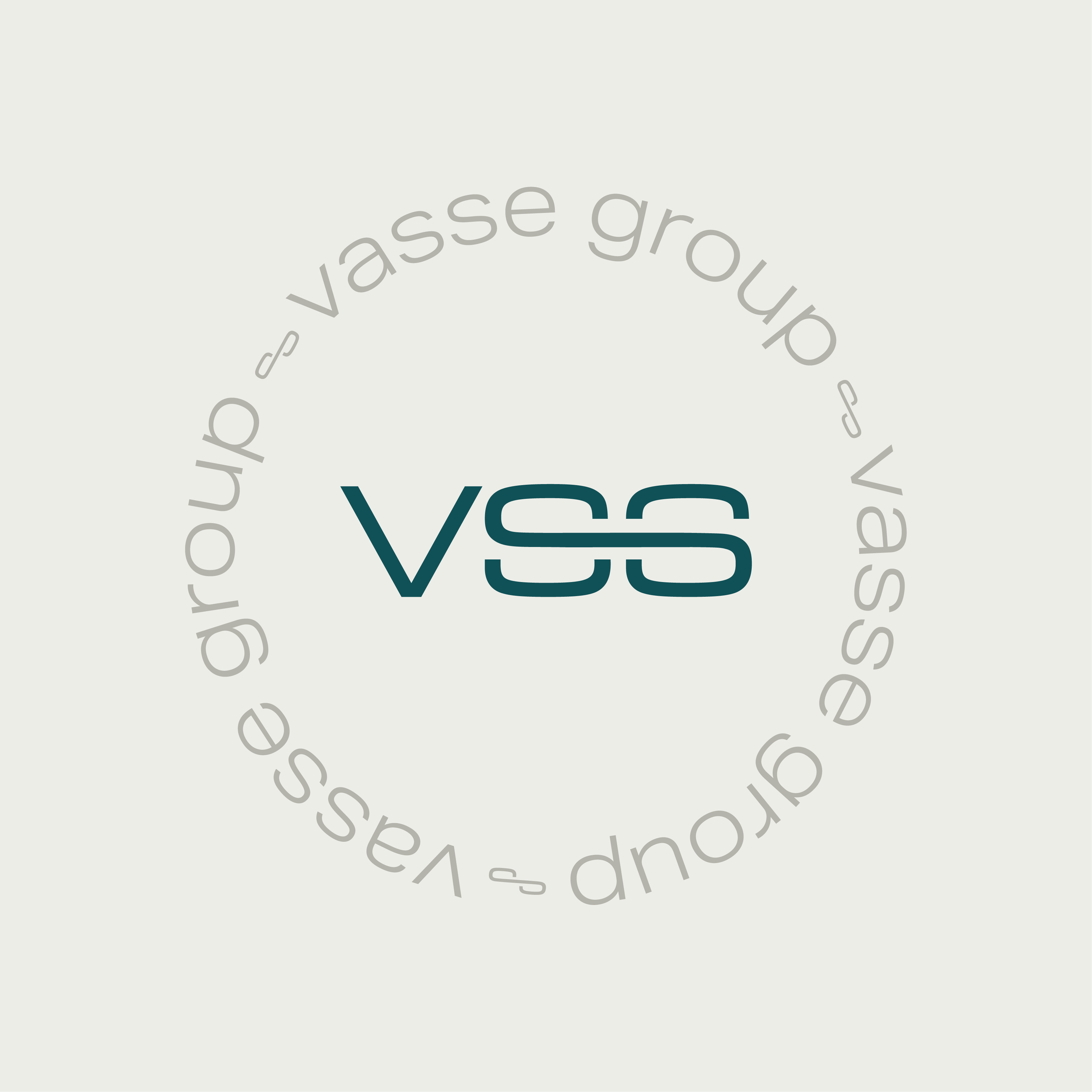
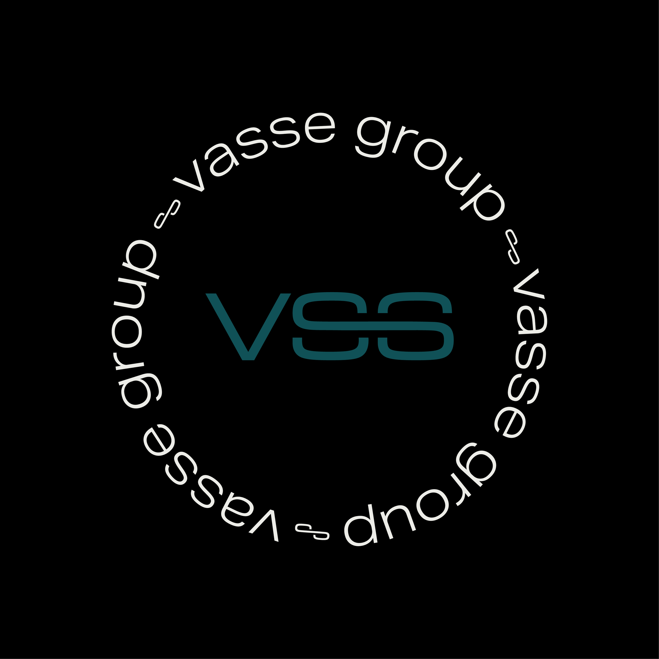
his logo keeps the same themes, fonts, and iconography going, but provides an opportunity for the fun side of the brand to be represented. This could be suitable for stamps, stickers on packages, and stationery.
This logo option further emphases the connected nature of the branding by presenting the writing in a chain-like circle.
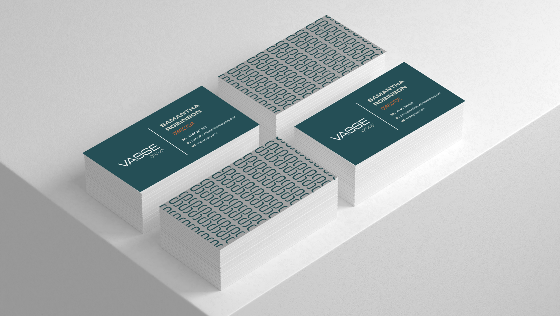
Business Cards
Website Mock-up
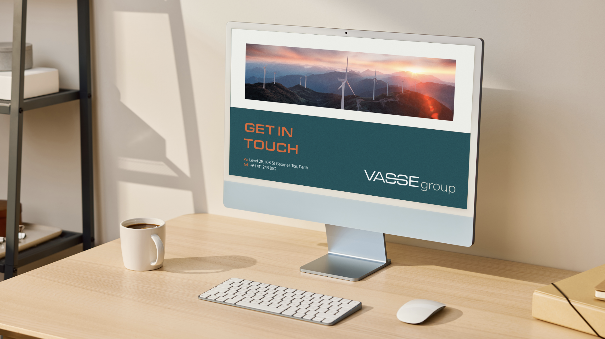
Design Mockups
